How I Achieve 95+ Mobile Lighthouse Scores on Heavy E-Commerce Stores
A comprehensive, step-by-step masterclass on transforming sluggish 30-score online stores into sub-second, 95+ mobile Lighthouse powerhouses.

1. The Heavy E-Commerce Dilemma
The first audit I run on any client store starts with the same step: open DevTools, filter the Network panel by third-party domains, and count. On a typical "heavy" store the list looks like this: Meta Pixel, TikTok Pixel, GA4, Google Ads, Klaviyo, Hotjar, a reviews widget, a chat bubble, a currency converter, a loyalty app, and three or four scripts nobody can explain. Marketing added each one for a good reason. Together they turn a phone into a space heater.
That's the dilemma. Marketing needs attribution data and retargeting audiences. Engineering needs a page that renders in about a second. Both sides are right, and the job is to make both true at the same time instead of picking a winner.
Why stock themes score 20 to 35 on mobile
Lighthouse's mobile run doesn't test your store on your laptop. It emulates a mid-range Android phone (historically a Moto G4, now a Moto G Power profile) with a 4x CPU slowdown and simulated Slow 4G (roughly 1.6 Mbps with 150 ms round-trip time). Your development machine is probably an order of magnitude faster than that device, so JavaScript that feels instant for you takes seconds to parse and execute there.
Most real shoppers are on hardware closer to the emulated device than to your laptop, so this is a fair test, not a punishment. Stock themes plus a dozen apps fail it because of the main thread: hundreds of kilobytes of JavaScript compiled and executed while the browser is also trying to paint.
The ROI
Speed is a revenue lever. Deloitte's "Milliseconds Make Millions" study for Google found that a 0.1 second improvement in mobile site speed was associated with measurable lifts in retail conversion rate and average order value. The exact figures vary by store, so I always measure my own clients' before and after instead of quoting industry averages. But the direction is consistent: on paid mobile traffic, every second of delay is ad spend you've already paid for and are wasting.
2. Dissecting the Real Culprits: LCP, INP, and TBT
Understand what the score is made of
The mobile Lighthouse performance score is a weighted blend, and the weights tell you where to work:
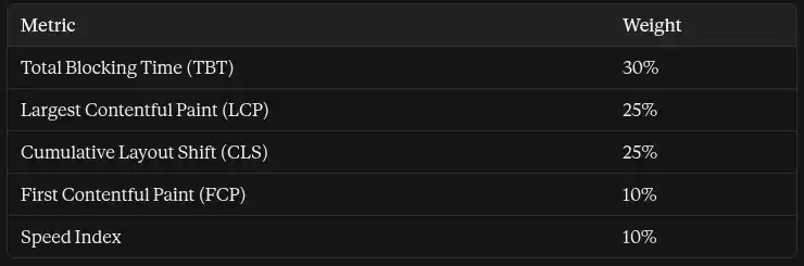
TBT alone is nearly a third of the score, and on heavy stores it's usually the worst metric. That's why 95+ is mostly a main-thread project.
The three metrics that matter
LCP (Largest Contentful Paint) measures when the biggest above-the-fold element finishes rendering, usually the hero or first product image. Google's "good" field threshold is 2.5 seconds at the 75th percentile. On mobile Lighthouse, that mark scores around 0.9, so to push the overall score above 95 I aim for roughly 1.2 to 1.8 seconds in the lab on fast templates.
TBT (Total Blocking Time) sums the portion above 50 ms of every long task between First Contentful Paint and Time to Interactive. A 300 ms task contributes 250 ms of blocking time. To score well you need total blocking under about 200 ms, which means eliminating long tasks, not shaving them.
INP (Interaction to Next Paint) replaced First Input Delay as a Core Web Vital in 2024. It reports the slowest interaction latency from real users, with a "good" threshold of 200 ms. Lighthouse's default navigation run does not measure INP, because there's no user interaction. TBT is the lab proxy for it: a page with low blocking time during load usually has healthy INP, but you still need field data to confirm it.
How I diagnose
- Set up an honest profile. In Chrome DevTools, open the Performance panel, set CPU to 4x slowdown and network to Slow 4G, and use an incognito window with extensions disabled. Extensions pollute the trace.
- Record a load and read the flame chart. Look at the Main track for tasks with the red corner marker. Those are your long tasks. Click each one and see which script it belongs to.
- Group by domain. In the Bottom-Up tab, use "Group by Domain" or "Group by Product" to see how much main-thread time belongs to each third party. This settles arguments with marketing: the numbers are right there.
- Check the Coverage panel to see how much of each JavaScript and CSS bundle actually runs during load.
- Confirm on WebPageTest using a mobile profile on a throttled connection. The waterfall and filmstrip show what the visitor sees and when the critical requests start.
- Get field data. PageSpeed Insights shows Chrome UX Report data, and I ship the web-vitals library's attribution build so INP and LCP problems point to the exact element:
import { onINP, onLCP, onCLS } from 'web-vitals/attribution';

function send({ name, value, attribution }) {
  navigator.sendBeacon('/vitals', JSON.stringify({
    name,
    value: Math.round(value),
    target: attribution?.interactionTarget || attribution?.element || null,
  }));
}

onINP(send);
onLCP(send);
onCLS(send);
3. Relocating Hero and Product Images to Sub-Second LCP
The browser discovery problem
Most slow LCP on e-commerce stores isn't slow because the image is big. It's slow because the browser finds it late. The usual offenders:
- The hero has loading="lazy". Many themes apply lazy loading to every image, including the one that's the LCP element. This delays the request on purpose.
- The hero is a CSS background-image. The preload scanner can't see it until the stylesheet has been downloaded and parsed.
- The hero is injected by a JavaScript slider. The image request doesn't start until the script boots.
- A preload points at a different file than the one the browser picks. If your <link rel="preload"> uses a fixed URL but the <img> uses srcset, the browser may download both.
The rule: the LCP image must be a real <img> in the initial HTML, not lazy, and marked high priority. Everything below the fold should be lazy.
fetchpriority and decoding
fetchpriority="high" tells the browser to move this request ahead of other images and scripts of similar priority. It's a hint, not a guarantee, but it's cheap and reliable. decoding="async" lets the browser decode the image off the critical path so it doesn't block painting other content. Explicit width and height attributes let the browser reserve space before the image arrives, which also helps CLS.
A production Liquid template
{%- comment -%} snippets/hero-image.liquid {%- endcomment -%}
{%- liquid
  assign img = section.settings.hero_image
  assign widths = '375, 550, 750, 1100, 1500, 2000'
-%}

{%- if img -%}
  {{ img
    | image_url: width: 2000
    | image_tag:
        widths: widths,
        sizes: '100vw',
        loading: 'eager',
        fetchpriority: 'high',
        decoding: 'async',
        width: img.width,
        height: img.height,
        class: 'hero__image'
  }}
{%- endif -%}
For non-hero images, such as the product grid, use accurate sizes values and lazy loading:
{{ product.featured_image
  | image_url: width: 600
  | image_tag:
      widths: '200, 300, 400, 600',
      sizes: '(min-width: 990px) 25vw, 50vw',
      loading: 'lazy',
      decoding: 'async'
}}
Wrong sizes is a silent killer: if you write sizes="100vw" on a card that's really 50vw wide, mobile downloads an image twice as large as needed.
When a preload helps, and when to use <picture>
If the <img> is early in the HTML, fetchpriority alone is enough. Add a preload only when the image appears late in the markup or is rendered by script, and make it match the responsive candidates:
<link rel="preload" as="image"
      imagesrcset="{{ img | image_url: width: 750 }} 750w, {{ img | image_url: width: 1500 }} 1500w"
      imagesizes="100vw"
      fetchpriority="high">
Use <picture> when you need art direction, like a tight portrait crop on mobile and a wide banner on desktop, or when serving from a host that doesn't negotiate formats:
<picture>
  <source media="(min-width: 750px)" srcset="hero-wide.avif" type="image/avif">
  <source media="(min-width: 750px)" srcset="hero-wide.webp" type="image/webp">
  <source srcset="hero-tall.avif" type="image/avif">
  <source srcset="hero-tall.webp" type="image/webp">
  <img src="hero-tall.jpg" width="750" height="900"
       fetchpriority="high" decoding="async" alt="Summer collection">
</picture>
Shopify's CDN handles format negotiation itself, so on a stock theme you usually don't need the <source> elements for format alone.
4. The Critical CSS and Font Delivery Blueprint
Kill render-blocking CSS without causing FOUC
Every <link rel="stylesheet"> in the head blocks rendering until it's downloaded and parsed. A 200 KB theme stylesheet plus app stylesheets can hold the whole page hostage. The fix is to inline only what's needed for the first screen and load the rest without blocking.
- Extract critical CSS per template (home, collection, product) using a tool like critical or Penthouse against a mobile viewport. It must cover the header, announcement bar, hero and first product row.
- Inline it in a <style> tag in the head.
- Load the full stylesheet asynchronously:
<style>{% render 'critical-css', template: template.name %}</style>

<link rel="preload" href="{{ 'theme.css' | asset_url }}" as="style"
      onload="this.onload=null;this.rel='stylesheet'">
<noscript><link rel="stylesheet" href="{{ 'theme.css' | asset_url }}"></noscript>
FOUC happens when the critical CSS misses something that's visible on load, so I test with JavaScript disabled and with cache cleared, and I regenerate the critical file whenever the theme's above-the-fold sections change.
Self-host fonts and control the swap
Third-party font hosts add DNS, connection and request overhead before text can render. I self-host subsetted WOFF2 files, preload only the one or two faces used above the fold, and use font-display: swap so text is visible immediately in a fallback font instead of staying invisible (FOIT):
<link rel="preload" href="{{ 'inter-var-latin.woff2' | asset_url }}"
as="font" type="font/woff2" crossorigin>@font-face {
font-family: 'Inter';
src: url('inter-var-latin.woff2') format('woff2');
font-weight: 100 900;
font-display: swap;
unicode-range: U+0000-00FF;
}
/* Metric-matched fallback so the swap doesn't shift layout */
@font-face {
font-family: 'Inter Fallback';
src: local('Arial');
size-adjust: 107%;
ascent-override: 90%;
descent-override: 22%;
line-gap-override: 0%;
}
body { font-family: 'Inter', 'Inter Fallback', sans-serif; }swap fixes invisible text but can cause a visible jump when the real font loads, which counts against CLS. The metric-matched fallback minimizes it. The override values above are approximations, so generate exact ones with a tool like Capsize or Fontaine.
Finally, use preconnect sparingly and only for cross-origin hosts that serve critical assets. Too many preconnects compete for early bandwidth.
5. Offloading Third-Party Scripts: Partytown and Web Workers
The number one mobile killer
On most heavy stores, third-party JavaScript accounts for more main-thread time than the theme itself. Tracking pixels, session recorders and widgets all parse and execute on the same thread that paints and handles taps. My approach is to sort every script into one of three buckets:
- Must stay on the main thread: anything that touches the cart, checkout, payments, or the visible UI a shopper interacts with.
- Can move off the main thread: analytics and pixels that only send data (GA4, Meta, TikTok, ad platforms).
- Can wait: widgets that shoppers don't need at load (chat, reviews, popups, heatmaps).
Option A: Web Workers with Partytown
Partytown runs third-party scripts in a Web Worker and proxies DOM access, so heavy analytics code doesn't compete with rendering. A basic setup:
<script>
  partytown = {
    forward: ['dataLayer.push', 'fbq'],
    resolveUrl(url, location, type) {
      if (type === 'script' && url.hostname === 'connect.facebook.net') {
        const proxy = new URL('/proxy/fb', location.origin);
        proxy.searchParams.append('url', url.href);
        return proxy;
      }
      return url;
    },
  };
</script>
<script src="/~partytown/partytown.js"></script>

<script type="text/partytown"
        src="https://www.googletagmanager.com/gtag/js?id=G-XXXXXXX"></script>
Three things to know before you commit:
- CORS. Scripts running in a worker need proper CORS headers, and many third parties don't send them, hence the reverse-proxy resolveUrl above.
- Platform constraints. Partytown relies on either cross-origin isolation headers or a service worker served from the site root. Hosted Shopify storefronts generally don't let you set those headers or serve a root service worker, so Partytown is a better fit for headless (Hydrogen, Next.js) and custom stacks.
- Not everything works. Scripts that need synchronous access to complex DOM behavior can break. Test every tag and verify that events still arrive.
Option B: Shopify's Customer Events sandbox
On a hosted Shopify store, the native way to move analytics off your theme is Customer Events (web pixels). Pixels configured there run in a sandbox, separate from the theme's main thread, and they respect the store's consent settings. I migrate GA4, Meta and TikTok there wherever the platform's official integration exists, which also removes those scripts from the theme entirely.
The facade pattern for widgets
For everything that can wait, load on first interaction, with a timeout as a safety net:
const loadDeferred = (() => {
  let loaded = false;
  return () => {
    if (loaded) return;
    loaded = true;
    ['https://widget.example.com/chat.js', 'https://reviews.example.com/loader.js']
      .forEach((src) => {
        const s = document.createElement('script');
        s.src = src;
        s.async = true;
        document.head.appendChild(s);
      });
  };
})();

['scroll', 'pointermove', 'touchstart', 'keydown'].forEach((evt) =>
  window.addEventListener(evt, loadDeferred, { once: true, passive: true })
);

// Safety net: load on idle even if the visitor never interacts
setTimeout(() => (window.requestIdleCallback || setTimeout)(loadDeferred), 5000);
For a chat bubble, go further: render a static button that looks like the widget, and load the real script when it's tapped.
Fixing INP with main-thread yielding
function yieldToMain() {
  if (globalThis.scheduler?.yield) return scheduler.yield();
  return new Promise((resolve) => setTimeout(resolve, 0));
}

async function processInChunks(items, fn, budgetMs = 40) {
  let start = performance.now();
  for (const item of items) {
    fn(item);
    if (performance.now() - start > budgetMs) {
      await yieldToMain();
      start = performance.now();
    }
  }
}
6. Eliminating Layout Shifts and Taming Hydration Overhead
Reserve space before content arrives
CLS is 25% of the score and one of the cheapest to fix. Everything that renders late needs a reserved box:
.hero__media      { aspect-ratio: 4 / 5; }
.card__media      { aspect-ratio: 1 / 1; }
.announcement-bar { min-height: 40px; }
.price-slot       { min-height: 1.5em; }

.skeleton {
  background: linear-gradient(90deg, #eee 25%, #f5f5f5 50%, #eee 75%);
  background-size: 200% 100%;
  animation: shimmer 1.2s infinite;
}
@keyframes shimmer { to { background-position: -200% 0; } }
Hydration and JavaScript boot cost
In headless storefronts, hydrating the whole component tree at load is a main-thread tax. I reduce it by hydrating only what's interactive and visible: island architecture or partial hydration for below-the-fold sections, server-rendering static content, and code-splitting routes and heavy components. In classic Shopify themes the equivalent is deferring section JavaScript and initializing components with IntersectionObserver when they scroll into view, instead of booting every section on load.
The layout shift audit checklist
Run this on every store:
- Does the announcement bar have a fixed height, and does it appear in the initial HTML instead of being injected by JS?
- Does the currency or country selector change text width after geolocation resolves?
- Do all images and videos have width and height or an aspect-ratio?
- Do late-loading app blocks (reviews stars, badges, upsell widgets) sit in reserved containers?
- Does the cookie banner overlay content instead of pushing it?
- Does the font swap use a metric-matched fallback?
- Do sticky headers change height on scroll?
7. Before-and-After Case Study and Benchmarks
Here's the shape of a typical transformation. These numbers are an illustrative benchmark showing the profile of a 31 to 96 rebuild, not a single named store, so replace them with your own audit exports when you publish.
Starting point: a mid-sized fashion store, a premium theme, 21 third-party scripts, a slider hero with a lazy-loaded first slide, and a stylesheet bundle of several hundred kilobytes.
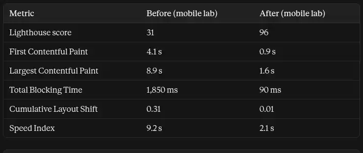
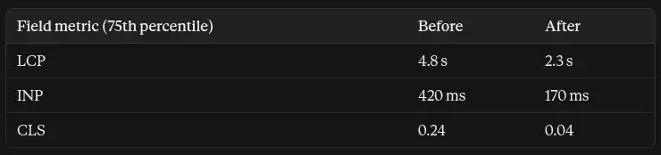
What moved the needle, in order of impact:
- Making the hero a real, eager, high-priority <img> cut LCP the most.
- Moving analytics pixels to Customer Events and gating chat and reviews cut TBT by around 90%.
- Inlined critical CSS plus async loading removed the render-blocking chain.
- Reserved space and a metric-matched font brought CLS to near zero.
Measuring the business impact. Lab scores don't pay invoices, so I track four numbers for 30 days before and after: mobile bounce rate on paid traffic, mobile conversion rate, add-to-cart rate, and ROAS by campaign. Segment by device and traffic source in GA4 and compare against the ad platforms' own reporting. Speed changes rarely arrive alone, so I avoid launching promotions or redesigns during the comparison window.
8. Summary and Key Engineering Rules
Getting to 95 is a project. Keeping it there is a discipline. These are the five rules I hold clients to:
- Set a performance budget. Cap third-party scripts, total JavaScript and image weight, and fail reviews that exceed them.
- One owner per tag. Every script needs a named owner and a business reason, and gets removed when the campaign ends.
- Test every app before installing it. Run Lighthouse and a trace on a duplicate theme, because a single app can erase months of work.
- Monitor field data, not just lab scores. Ship the web-vitals attribution build and watch INP and LCP by template.
- Never optimize away measurement. Verify tracking after every change, because speed that breaks attribution costs the client more than it saves.
For engineers and agency owners: performance work is a sales asset and a retention tool, because it produces numbers a client can see in their ad dashboard. Do it once, document the budget, and it protects every future update.
Written by Nazmul Hawlader
Top RatedSenior Full-Stack Engineer & Official Shopify App Store developer. Founder of Stockly and Kilo (kilo.nazmulcodes.org), specializing in high-performance Shopify apps, client-side media compression, and sub-second web performance.