Zero CLS Masterclass: Eliminating Cumulative Layout Shift in Dynamic Web Applications
How to diagnose and fix layout shifts caused by web fonts, dynamically loaded banner ads, image carousels, and asynchronous review widgets.

1. Introduction: The Silent Conversion Killer
You're about to tap "Place order." The page finishes loading a review widget above the button, everything slides down 80 pixels, and your thumb lands on "Continue shopping" instead. Or you're reading an article, a banner ad injects itself above the paragraph, and you lose your place. Nobody files a bug report for this. They just leave.
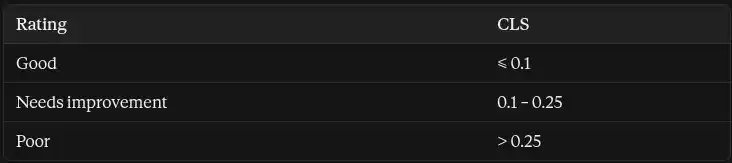
That's the real cost of layout shift. It causes accidental clicks, abandoned carts and lost trust, and it's also a ranking input, because Cumulative Layout Shift (CLS) is one of the three Core Web Vitals that feed Google's page experience signals.
The scoring thresholds, assessed at the 75th percentile of real page loads (segmented by mobile and desktop):
Modern dynamic applications are especially prone to it. Server-rendered React, Next.js and Remix apps ship complete HTML that looks final, then hydrate and change it: a mobile menu decided by window.innerWidth, a logged-in header that swaps in after a fetch, a theme read from localStorage, a dismissible banner whose state only the browser knows. Add third-party ads and widgets that inject DOM whenever they feel like it, and you have a page that reflows for its entire lifespan.
This guide goes below the surface. We'll look at how the browser computes the score, how to see the shifts, and four blueprints that fix the most common causes, with production code for each. The goal is a 0.00 you can defend in CI, not a lucky screenshot.
2. The Mechanics: How the Layout Instability API Computes CLS
The formula
Every individual layout shift gets a score:
Layout Shift Score = Impact Fraction × Distance Fraction- Impact fraction: the area of the union of the unstable elements' visible rectangles (both their position in the previous frame and in the current one), divided by the viewport area.
- Distance fraction: the greatest distance any unstable element moved (in either axis), divided by the viewport's largest dimension.
Worked example. An element fills the top 50% of the viewport and shifts down by 25% of the viewport height. The union of its old and new positions covers 75% of the viewport, so the impact fraction is 0.75. It moved 25% of the viewport height, so the distance fraction is 0.25. The score is 0.75 × 0.25 = 0.1875, a single shift that alone puts you in "needs improvement."
A more realistic example. A 60 px promo banner is injected above the content on a 412 × 823 phone. Everything moves down 60 px. The union of old and new positions covers essentially the whole viewport (impact ≈ 1.0), and the distance fraction is 60 / 823 ≈ 0.073. Score ≈ 0.073, which spends about 73% of your entire "good" budget on one banner.
Session windows
CLS isn't the sum of every shift over the life of the page. Since 2021 it's the largest burst of shifts, called a session window. A window groups shifts that occur less than 1 second apart, capped at 5 seconds in total. Your CLS is the score of the worst window. This means one bad burst on load matters far more than tiny shifts spread over a long session.
How Blink decides what's "unstable"
Conceptually, Blink's layout shift tracker compares the visual rectangles of layout objects between consecutive frames. An element becomes an unstable source when its start position (its top-left corner) changes relative to the viewport without a qualifying cause. Details that matter in practice:
- Newly inserted elements don't count as shifted themselves. The things they push do. That's why an ad slot mounting at height: 0 and then growing is so damaging: everything below it moves.
- Scrolling isn't a shift. The tracker accounts for scroll offset.
- transform animations don't cause shifts. Only changes that go through layout, such as top, margin, height or width, do.
- Invisible content is ignored. Objects with no visible painted content don't contribute.
- Only the largest few sources are reported in each entry's attribution list.
The 500 ms input exclusion
Shifts that occur within 500 ms of a discrete user input (click, tap, key press) are flagged hadRecentInput: true and excluded from CLS, because the user probably expected the change. This is deliberately narrow: scrolling and hover/mouse-move don't count as inputs, and a shift that happens 600 ms after a tap is still counted.
Debugging in Chrome DevTools
- Rendering panel → "Layout Shift Regions." Enable it and reload. Elements that shift flash with a blue overlay, which is the fastest way to see where instability lives.
- Performance panel. Record a load with CPU throttling and look at the layout shift markers (the label and location differ between DevTools versions, and newer versions surface them as "layout shift culprits" in the insights view). Selecting a shift shows its score and the moved node, with before and after rectangles. Correlate it with long tasks: a busy main thread delays late-arriving content, which makes shifts bunch together.
- Programmatic tracking. In the console or in production, use PerformanceObserver:
// cls-debug.ts
type ShiftSource = { node: Node | null; previousRect: DOMRectReadOnly; currentRect: DOMRectReadOnly };
interface LayoutShiftEntry extends PerformanceEntry {
  value: number;
  hadRecentInput: boolean;
  sources: ShiftSource[];
}

let windowValue = 0;
let windowStart = 0;
let lastShift = 0;
let clsValue = 0;

const observer = new PerformanceObserver((list) => {
  for (const entry of list.getEntries() as LayoutShiftEntry[]) {
    if (entry.hadRecentInput) continue;

    // Start a new session window after a 1s gap or 5s of duration
    const gap = entry.startTime - lastShift;
    const age = entry.startTime - windowStart;
    if (windowValue && (gap > 1000 || age > 5000)) windowValue = 0;
    if (!windowValue) windowStart = entry.startTime;

    windowValue += entry.value;
    lastShift = entry.startTime;
    clsValue = Math.max(clsValue, windowValue);

    console.log(
      `Shift ${entry.value.toFixed(4)} | CLS so far ${clsValue.toFixed(4)}`,
      entry.sources.map((s) => ({
        node: s.node,
        from: s.previousRect.toJSON(),
        to: s.currentRect.toJSON(),
      }))
    );
  }
});

observer.observe({ type: "layout-shift", buffered: true });
For production RUM, don't reimplement this. Use the web-vitals library's attribution build, which reports which element caused the largest shift:
import { onCLS } from "web-vitals/attribution";

onCLS(({ value, attribution }) => {
  navigator.sendBeacon("/vitals", JSON.stringify({
    metric: "CLS",
    value,
    target: attribution.largestShiftTarget,   // CSS selector of the culprit
    time: attribution.largestShiftTime,
    loadState: attribution.loadState,          // loading | dom-interactive | complete...
  }));
});Blueprint 1: Dynamic Banner Ads and Injected Embeds
The number one culprit
The classic pattern: an ad slot renders as an empty <div> with height: 0, the ad script loads a creative, and the slot expands to 250 px, pushing the article down. Marketing banners and cookie bars inject the same way. The rule is simple: the slot's geometry must be decided by your CSS before the third party knows anything.
The architecture
- Reserve the slot with min-height (or aspect-ratio) matching the creative size for that breakpoint.
- For multi-size slots, reserve the tallest size the slot can return. Extra whitespace is ugly but not a shift, while a too-small reservation is a guaranteed shift.
- Never collapse an unfilled slot to zero. Collapsing is itself a shift for content below. Show a fallback (house content, a label, or just the reserved space).
- Render below-the-fold slots lazily but keep the reservation in place. Shifts only count inside the viewport, and a reserved box costs nothing.
contain: layout style, and what it doesn't do
contain: layout style tells the browser that the element's internals don't affect the outside layout. Layout containment makes the box an independent formatting context, and it becomes the containing block for absolute and fixed descendants. Style containment scopes things like counters. The important caveat: containment doesn't reserve space. If the box's own size changes, the outside still reflows. Containment protects the outside from what happens inside a box whose size you've already fixed, so you need both.
Production CSS
.ad-slot {
  /* Reserved geometry: mobile-first, tallest creative for this breakpoint */
  --ad-w: 320px;
  --ad-h: 250px;

  display: grid;
  place-items: center;
  box-sizing: border-box;
  width: 100%;
  max-width: var(--ad-w);
  min-height: var(--ad-h);
  margin-inline: auto;

  contain: layout style;          /* internals can't reflow the page */
  background: var(--ad-bg, #f5f5f5);
  color: #767676;
  font: 500 0.75rem/1 system-ui, sans-serif;
  overflow: hidden;
}

.ad-slot::before {
  content: "Advertisement";       /* visible fallback while empty or unfilled */
}
.ad-slot[data-filled="true"]::before { content: none; }

@media (min-width: 768px) {
  .ad-slot--leaderboard { --ad-w: 728px; --ad-h: 90px; }
}
@media (min-width: 1024px) {
  .ad-slot--sidebar     { --ad-w: 300px; --ad-h: 600px; }
}

/* Offscreen sections: skip rendering work, but keep a stable size */
.below-fold-section {
  content-visibility: auto;
  contain-intrinsic-size: auto 600px;
}
A typed React wrapper
import { useEffect, useRef, useState, type CSSProperties } from "react";

type Size = readonly [width: number, height: number];

interface AdSlotProps {
  slotId: string;
  sizes: readonly Size[];
  variant?: "leaderboard" | "sidebar" | "inline";
  onMount?: (el: HTMLDivElement) => void; // hand the element to your ad library
}

export function AdSlot({ slotId, sizes, variant = "inline", onMount }: AdSlotProps) {
  const ref = useRef<HTMLDivElement>(null);
  const [filled, setFilled] = useState(false);

  // Reserve the tallest and widest creative this slot can return
  const reservedH = Math.max(...sizes.map(([, h]) => h));
  const reservedW = Math.max(...sizes.map(([w]) => w));

  useEffect(() => {
    const el = ref.current;
    if (!el) return;

    // Load the ad only when it's near the viewport; space is already reserved
    const io = new IntersectionObserver(
      ([entry]) => {
        if (!entry.isIntersecting) return;
        io.disconnect();
        onMount?.(el);
      },
      { rootMargin: "300px" }
    );
    io.observe(el);

    // Mark as filled once the third party inserts something
    const mo = new MutationObserver(() => setFilled(el.childElementCount > 0));
    mo.observe(el, { childList: true });

    return () => { io.disconnect(); mo.disconnect(); };
  }, [onMount]);

  const style = {
    "--ad-w": `${reservedW}px`,
    "--ad-h": `${reservedH}px`,
  } as CSSProperties;

  return (
    <div
      id={slotId}
      ref={ref}
      className={`ad-slot ad-slot--${variant}`}
      data-filled={filled}
      style={style}
    />
  );
}4. Blueprint 2: Eliminating Font-Swap Shifts (FOUT / FOIT)
The trade-off
font-display: swap removes invisible text (FOIT) by rendering immediately in a fallback font, then swapping to the web font when it arrives. The swap can shift layout because the two fonts differ in average glyph width, ascent, descent and line gap. Text reflows, lines wrap differently, and everything below moves. That's flash of unstyled text (FOUT), and it registers as CLS.
You have three options: font-display: optional (the web font only applies if it's ready almost immediately, so no swap happens but first-time visitors may see the fallback), preloading to shrink the swap window, and metric-matching the fallback so the swap barely moves anything. The third one is the general answer.
The descriptors
@font-face supports four descriptors that adjust a font's metrics:
- size-adjust scales glyphs, matching average width
- ascent-override and descent-override set the space above and below the baseline
- line-gap-override sets extra line spacing
Calculate them like this:
size-adjust      = webFontAvgCharWidth / fallbackAvgCharWidth
ascent-override  = (webFont.ascent  / unitsPerEm) / size-adjust
descent-override = (|webFont.descent| / unitsPerEm) / size-adjust
line-gap-override= (webFont.lineGap / unitsPerEm) / size-adjust
Worked example
Suppose a geometric sans-serif ("Brand Sans") has unitsPerEm = 1000, ascent = 1050, descent = −350, line gap = 100, and its average character width is 1.08× Arial's. These are illustrative numbers to show the math:
- size-adjust = 1.08 → 108%
- ascent-override = 1.05 / 1.08 = 0.9722 → 97.22%
- descent-override = 0.35 / 1.08 = 0.3241 → 32.41%
- line-gap-override = 0.10 / 1.08 = 0.0926 → 9.26%
@font-face {
  font-family: "Brand Sans";
  src: url("/fonts/brand-sans-var.woff2") format("woff2");
  font-weight: 100 900;
  font-display: swap;
}

@font-face {
  font-family: "Brand Sans Fallback";
  src: local("Arial");
  size-adjust: 108%;
  ascent-override: 97.22%;
  descent-override: 32.41%;
  line-gap-override: 9.26%;
}

:root {
  --font-body: "Brand Sans", "Brand Sans Fallback", system-ui, sans-serif;
}
body { font-family: var(--font-body); }
For a real font, here are typical values for Inter matched to Arial:
@font-face {
  font-family: "Inter Fallback";
  src: local("Arial");
  size-adjust: 107.4%;
  ascent-override: 90.2%;
  descent-override: 22.5%;
  line-gap-override: 0%;
}
Don't hand-calculate in production. Tools like Capsize and Fontaine read the font file and generate exact values, and frameworks such as Next.js do this automatically for their font loader. Browser support for the override descriptors varies (Safari has lagged on some), and unsupported browsers simply ignore them and fall back to the default swap behavior, so it's a progressive enhancement.
Finish the job with a preload for the one or two faces used above the fold, so the swap window is short:
<link rel="preload" href="/fonts/brand-sans-var.woff2" as="font" type="font/woff2" crossorigin>5. Blueprint 3: Asynchronous E-Commerce and Third-Party Widgets
The danger of late-injected content
E-commerce pages are a minefield: trust badges, review stars (Yotpo, Judge.me), currency and country switchers, dynamic announcement bars, shipping estimators and "only 3 left" counters. Each is fetched or injected after first paint, and each sits inside a layout that has already been painted.
Reserve geometry, then fill it
The principle is the same for every widget: the container exists with its final dimensions before the content does.
- Fixed-height rows for single-line widgets: min-height in rem or lh units so it scales with font size.
- aspect-ratio for widgets with a known shape, such as badge strips and video embeds. Grid or flexbox with explicit tracks so a late child fills a reserved cell instead of creating a new row: grid-template-rows: auto 1.25rem auto.
- Reserve width for values that change length, like currency switchers, with min-width in ch units and font-variant-numeric: tabular-nums so digits don't change width.
- Server-render what you can. If the announcement bar's dismissed state lives only in localStorage, the server renders it and the client removes it, which is a shift. Store dismissal in a cookie and render the correct state on the server. In Remix:
// app/root.tsx
import { createCookie } from "@remix-run/node";
import type { LoaderFunctionArgs } from "@remix-run/node";

const prefs = createCookie("prefs", { maxAge: 31_536_000, sameSite: "lax" });

export async function loader({ request }: LoaderFunctionArgs) {
  const saved = (await prefs.parse(request.headers.get("Cookie"))) ?? {};
  return {
    currency: (saved.currency as string) ?? "USD",
    bannerDismissed: Boolean(saved.bannerDismissed),
  };
}
The HTML the server sends now matches what the client will render, so hydration changes nothing visible.
Skeletons must match production dimensions exactly
A skeleton that's 20 px shorter than the real content just moves the shift from "content appears" to "skeleton is replaced." The reliable way is to make the skeleton and the loaded state share the same wrapper and the same CSS variables:
.reviews-summary {
  --stars-h: 1.25rem;
  display: flex;
  align-items: center;
  gap: 0.5rem;
  min-height: var(--stars-h);
  contain: layout style;
}

.skeleton {
  height: var(--stars-h);
  width: 8rem;
  border-radius: 4px;
  background: linear-gradient(90deg, #eee 25%, #f6f6f6 50%, #eee 75%);
  background-size: 200% 100%;
  animation: shimmer 1.2s linear infinite;
}
@keyframes shimmer { to { background-position: -200% 0; } }

@media (prefers-reduced-motion: reduce) { .skeleton { animation: none; } }import { useEffect, useState } from "react";
interface ReviewData { rating: number; count: number }
export function ReviewsSummary({ productId }: { productId: string }) {
const [data, setData] = useState<ReviewData | null>(null);
useEffect(() => {
const ctrl = new AbortController();
fetch(`/api/reviews/${productId}/summary`, { signal: ctrl.signal })
.then((r) => r.json() as Promise<ReviewData>)
.then(setData)
.catch(() => { /* keep the reserved space on failure */ });
return () => ctrl.abort();
}, [productId]);
return (
<div className="reviews-summary" aria-live="polite">
{data ? (
<>
<span aria-label={`${data.rating} out of 5 stars`}>★ {data.rating.toFixed(1)}</span>
<span>({data.count})</span>
</>
) : (
<div className="skeleton" aria-hidden="true" />
)}
</div>
);
}Two more rules. Animate skeletons with background-position or opacity, not with size. And when you animate elements in or out (a toast, a drawer), use transform, which doesn't participate in layout shifts.
6. Blueprint 4: Responsive Media and Dynamic Carousels
Width and height attributes
Always put width and height attributes on every <img>. Browsers map them to a default aspect-ratio before the file loads, so the space is reserved from the first layout pass. Pair them with responsive CSS:
img { max-width: 100%; height: auto; }The attributes give the ratio and CSS controls the rendered size, so it's responsive without a shift. This is the simplest fix on most sites, and the most commonly missed.
Carousels
JavaScript slider libraries are a frequent source of shifts, because before initialization the slides often render stacked or at natural size, then collapse into a track when the script runs. Three defenses:
- Fix the frame with CSS (an aspect-ratio on the viewport) so it has its final height before JS runs.
- Normalize slide shapes with object-fit: cover so a slide with a different image ratio can't resize the frame.
- Prefer CSS scroll-snap where you can, because it needs no initialization at all.
.carousel {
  display: grid;
  grid-auto-flow: column;
  grid-auto-columns: 100%;
  aspect-ratio: 16 / 9;
  overflow-x: auto;
  scroll-snap-type: x mandatory;
  scrollbar-width: none;
  contain: layout style;
}
@media (max-width: 599px) {
  .carousel { aspect-ratio: 4 / 5; }   /* art direction decided in CSS, not JS */
}
.carousel > * { scroll-snap-align: start; }
.carousel img { width: 100%; height: 100%; object-fit: cover; display: block; }
Changing the ratio inside a media query is safe because it's resolved before the first paint. Changing it after load with JavaScript is not.
Zero-shift responsive image card
interface ImageCardProps {
  src: string;
  alt: string;
  width: number;            // intrinsic pixel width of the source
  height: number;           // intrinsic pixel height of the source
  srcSet: string;           // e.g. "img-400.avif 400w, img-800.avif 800w"
  sizes: string;            // e.g. "(min-width: 990px) 25vw, 50vw"
  priority?: boolean;       // true only for the LCP image
  title: string;
}

export function ImageCard({ src, alt, width, height, srcSet, sizes, priority = false, title }: ImageCardProps) {
  return (
    <article className="card">
      <img
        src={src}
        srcSet={srcSet}
        sizes={sizes}
        alt={alt}
        width={width}
        height={height}
        loading={priority ? "eager" : "lazy"}
        decoding="async"
        {...(priority ? { fetchPriority: "high" as const } : {})}
      />
      <h3>{title}</h3>
    </article>
  );
}.card img { width: 100%; height: auto; display: block; border-radius: 8px; }Native loading="lazy" is safe for CLS as long as dimensions are declared, because the reserved box means the image arriving changes nothing around it. Without them, lazy loading turns every scroll into a shift.
7. Verification, CI/CD Automated Guardrails and Conclusion
Lighthouse CI
Catch regressions on every pull request:
{
  "ci": {
    "collect": {
      "url": ["http://localhost:3000/", "http://localhost:3000/products/example"],
      "numberOfRuns": 3
    },
    "assert": {
      "assertions": {
        "cumulative-layout-shift": ["error", { "maxNumericValue": 0.02 }]
      }
    }
  }
}
Use multiple runs and a tight threshold. But remember that Lighthouse only sees load-time shifts, so add a scripted user journey.
Puppeteer: shifts after load
// scripts/cls-guard.ts
import puppeteer from "puppeteer";

const URL = process.argv[2] ?? "http://localhost:3000/";
const BUDGET = Number(process.argv[3] ?? 0.02);

async function main() {
  const browser = await puppeteer.launch();
  const page = await browser.newPage();
  await page.emulate(puppeteer.KnownDevices["Pixel 5"]);

  // Install the observer before any page script runs
  await page.evaluateOnNewDocument(() => {
    (window as any).__cls = 0;
    new PerformanceObserver((list) => {
      for (const e of list.getEntries() as any[]) {
        if (!e.hadRecentInput) (window as any).__cls += e.value;
      }
    }).observe({ type: "layout-shift", buffered: true });
  });

  await page.goto(URL, { waitUntil: "networkidle0" });

  // Scroll through the page to trigger lazy content, ads and widgets
  await page.evaluate(async () => {
    for (let y = 0; y < document.body.scrollHeight; y += 400) {
      window.scrollTo(0, y);
      await new Promise((r) => setTimeout(r, 150));
    }
  });
  await new Promise((r) => setTimeout(r, 1500));

  const cls: number = await page.evaluate(() => (window as any).__cls);
  await browser.close();

  console.log(`CLS: ${cls.toFixed(4)} (budget ${BUDGET})`);
  if (cls > BUDGET) process.exit(1);
}

main();
This sums all shifts as a conservative guard; the official metric uses session windows, so it will never under-report. Run it in your pipeline and block merges that exceed the budget.
Five non-negotiable rules
- Every box gets its size before its content. Images get width and height, embeds get aspect-ratio, widgets get min-height.
- Never inject above existing content. Late-arriving UI goes into reserved slots, or below the viewport, or animates in with transform.
- Match server and client output. Anything derived from cookies, viewport or storage must be resolved on the server or hidden behind a reserved container.
- Metric-match your fallback fonts. Preload what's critical, and treat the swap as a layout event.
- Enforce it in CI and measure in the field. Lab checks block regressions, RUM with attribution finds what tests can't.
Closing thought
Zero CLS isn't a clever trick. It's a habit of asking, for every element on the page, "what does the browser know about this box's size at first layout?" If the answer is "nothing," you've found your next shift. Teams that build that question into design review and CI stop chasing layout bugs and start shipping pages that stay still.
Written by Nazmul Hawlader
Top RatedSenior Full-Stack Engineer & Official Shopify App Store developer. Founder of Stockly and Kilo (kilo.nazmulcodes.org), specializing in high-performance Shopify apps, client-side media compression, and sub-second web performance.